Key Takeaways:
- Mobile-first design is now essential for website success.
- Consider diverse mobile devices beyond just smartphones.
- Fast loading speeds are critical for mobile users.
- Simple navigation improves the mobile experience.
- Optimize content for smaller mobile screens.
- PWAs offer app-like features on the web.
- Mobile accessibility ensures inclusivity for all users.
- Mobile SEO requires specific optimization tactics.
- Local mobile SEO connects with nearby customers.
- Future mobile design involves AI and AR.
Mastering Mobile: Designing Great Websites for Today’s Mobile Users
Think about the last time you searched for something online. Chances are, you used your phone. Millions of people in the United States use their phones as their primary internet device.
This makes mobile website design more important than ever. You’re missing out if your website doesn’t work well on phones. Let’s explore how to create exceptional mobile experiences.
Statista’s page on US mobile internet use shows most Americans use phones/tablets to go online, and this keeps growing.
It details how often, how long, and what people do online via mobile (social media, shopping, video, etc.). The data breaks down usage by age and other demographics, often comparing it to desktop use.
It also covers the impact of mobile phones on online business and future trends in US mobile internet access. It’s a key resource for understanding America’s mobile-first online behavior.
The Mobile World: It’s More Than Just Screen Size
We often think of smartphones when we talk about mobile phones. But the mobile website design challenge includes more.
Tablets, foldable phones, and even smartwatches can access the web. These devices have different screen sizes and ways to interact.
Your design needs to adapt to all of them. Consider how content reflows on a tablet versus a small phone. Think about touch targets on a smartwatch screen. A flexible approach ensures everyone has a good experience.
Mobile users also behave differently. They expect information quickly and easily. They often browse on the go, with shorter attention spans.
Your mobile website design must respect this. Make key information easy to find. Ensure navigation is simple and clear. Think about the context of use.
Someone searching for a restaurant on their phone likely wants quick access to the menu, address, and phone number.
Faster mobile networks, like 5G, are changing things too. Users expect rich media to load instantly. While faster speeds offer new possibilities, optimization remains key.
Even on a fast connection, a poorly optimized site will feel slow. Consider using high-quality images and videos, but compress them well. Think about how 5G can enhance interactive elements on your mobile site.

Core Ideas for Effective Mobile Websites

Start by thinking small. Mobile-first design means you design for the smallest screen first. Then, you add features and adjust the layout for larger screens.
This approach keeps your code clean and your site fast. It also forces you to focus on the most important content for mobile users.
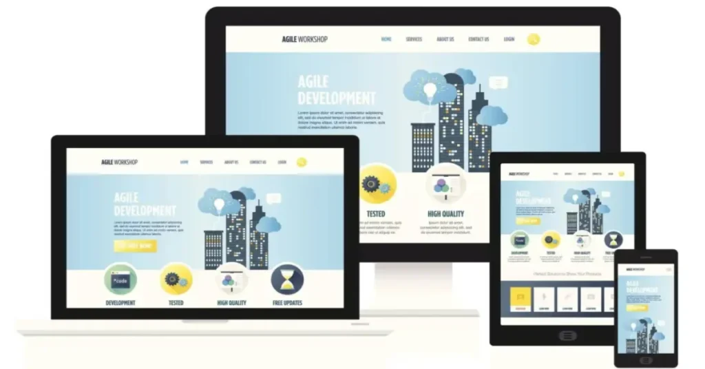
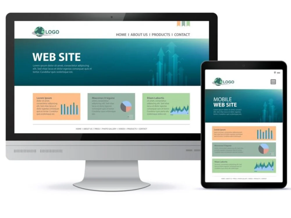
Responsive web design (RWD) is the technical foundation for mobile-first. RWD uses flexible layouts, adaptable images, and CSS media queries.
These techniques allow your website to change its appearance based on the screen size. Imagine a website with three columns on a desktop.
On a phone, those columns might stack vertically for better readability. RWD makes this happen smoothly.
Progressive Web Apps (PWAs) offer another exciting option for mobile website design. PWAs are websites that act like native mobile apps.
They can load instantly, work offline, and send push notifications. Users can even add them to their home screen.
PWAs bridge the gap between websites and apps, offering a richer mobile experience. For example, an e-commerce site as a PWA can offer offline browsing of previously viewed products and instant updates on sales.
Making Mobile User Experiences Great

Navigating a website on a small screen can be tricky. Make it easy. Use clear and simple navigation menus. Common patterns include hamburger menus and bottom navigation bars.
Ensure touch targets (buttons and links) are large enough and spaced out. This prevents accidental clicks. A clear visual structure helps users understand where they are and where to go.
Content needs to adapt to mobile too. Keep text concise and easy to scan. Use headings, subheadings, and bullet points to break up long paragraphs.
Optimize images and videos for mobile. Use formats like WebP for images to reduce file size without losing quality. Consider lazy loading images, so they only load when the user scrolls down.
Forms on mobile can be frustrating. Make them short and sweet. Use clear labels and appropriate input types (like a number pad for phone numbers).
Enable auto-fill where possible. Reducing the number of fields and making the process intuitive increases completion rates.
Think about how people interact with their phones. Swiping and pinching are common gestures. Consider incorporating these into your mobile website design where it makes sense.
For example, a photo gallery could use swipe gestures to navigate. However, don’t force gestures where standard interactions work better.
Make your mobile website accessible to everyone. Follow the Web Content Accessibility Guidelines (WCAG). Use proper ARIA attributes for mobile elements.
Ensure screen readers can understand your content. Design for users with visual, auditory, motor, and cognitive disabilities.
Test your mobile site with accessibility tools and on actual mobile devices. This ensures a good experience for all users.
Mobile Website Speed: Performance Matters

Slow websites frustrate everyone, especially mobile users. Studies show that a delay of even a few seconds can significantly increase bounce rates. Aim for your mobile site to load in under three seconds.
Go beyond basic image compression to improve speed. Minify your HTML, CSS, and JavaScript files. Use browser caching to store frequently accessed resources.
A Content Delivery Network (CDN) can distribute your website’s files across multiple servers, making them load faster for users worldwide.
For PWAs, service workers can cache entire pages and assets, enabling instant loading on repeat visits and offline access.
Explore newer image and video formats like AVIF and WebM, which offer better compression and quality. Code splitting can break your JavaScript into smaller chunks, so only the necessary code loads initially.
Test your mobile website speed regularly. Use tools like Google PageSpeed Insights, WebPageTest, and GTmetrix.
These tools provide valuable insights into your site’s performance and suggest areas for improvement.
Pay attention to key metrics like First Contentful Paint (FCP), Largest Contentful Paint (LCP), and Time to Interactive (TTI).
These metrics show how quickly your site loads and becomes usable.
Mobile SEO: Getting Found on Phones
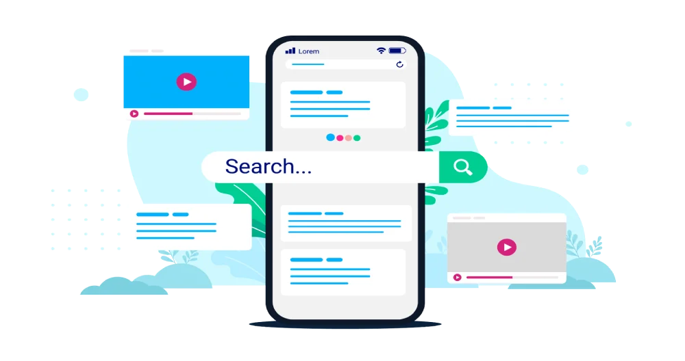
Google uses mobile-first indexing. This means Google primarily looks at the mobile version of your website to understand and rank it.
Google uses your mobile site for indexing and ranking. Ensure your mobile content matches your desktop content. Use responsive design if you can.
Let Google access everything on your mobile site. Keep robots meta tags and metadata consistent. Fix common mobile issues. Your mobile site is now key for Google.
Make sure your mobile site has all the important content and features of your desktop site. Avoid hiding content on mobile that is visible on desktop.
Optimize your mobile content for relevant keywords. Ensure your site is fast and easy to use on mobile, as these are ranking factors. Use structured data markup to help search engines understand your content better.
Local searches are often done on mobile. If you have a local business, local mobile SEO is crucial. Optimize your Google My Business profile.
Ensure your website has a mobile-friendly map and clear directions. Use click-to-call buttons for easy contact. Create location pages with specific information about each of your locations.
According to Moz, Mobile is often the top traffic source. Prioritize mobile usability and speed. Use responsive design if possible.
Optimize images and code for faster loading. Test your mobile site thoroughly. Local SEO is key for mobile. Avoid annoying ads. Focus on a great mobile experience.
The Future of Mobile Websites: What’s Next?
Mobile website design continues to change. Artificial intelligence (AI) could play a bigger role in personalization. Imagine websites that adapt content and layout based on individual user behavior and preferences on their mobile devices.
Augmented reality (AR) might become more integrated into mobile web experiences, offering interactive product previews or virtual tours. Interaction patterns could evolve with new device capabilities and user expectations.
Keep learning and adapting. The mobile landscape never stands still. By staying informed about new technologies and user trends, you can continue to deliver exceptional mobile experiences.

Conclusion
Creating great mobile website design is an ongoing process. By focusing on the user, embracing new technologies, and continuously optimizing, you can build mobile experiences that are fast, user-friendly, and effective.
Remember to think beyond the screen size and consider the entire mobile context. Your efforts will pay off with happier users and better results.